Here is the portfolio about our company that showcases our impressive creations and achievements in mobile application development, website development, and digital marketing and content creation. At Appxbuild, we take pride in delivering high-quality work that helps our clients achieve their business goals. With a team of over 50 technical experts who share the same work ethic, we are committed to providing exceptional services that meet and exceed our clients’ expectations.
Deteqted
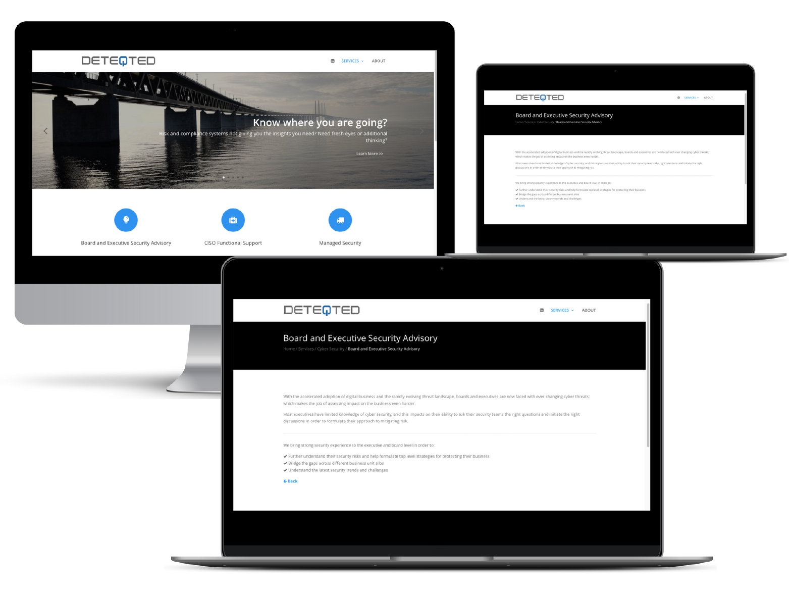
The website https://www.deteqted.com/ is a great resource for anyone looking for advice and support in the areas of cybersecurity, technology management, and leadership. As a web developer who has worked on this website, I can attest to the dedication and expertise of the team behind it, as well as the valuable resources and information available to users.
One of the key strengths of this website is the balanced technical, management, and leadership expertise that the team brings to the table. With a wealth of experience in these areas, they are able to provide comprehensive advice and support to executives and clients, helping them navigate the complex and ever-evolving world of cybersecurity and technology.
Another strength of this website is the team’s ability to communicate with different levels, translating complex technical issues into simple concepts that can be easily understood by non-technical audiences. This is a crucial skill in today’s world, where cybersecurity threats are a major concern for organizations of all sizes and industries.
The team at Deteqted also boasts a diverse and large team, providing unbiased and independent views of cyber issues and their solutions. This is a particularly important aspect of their work, as it ensures that clients receive the most accurate and effective advice and solutions, free from bias or vested interests.
Finally, the team at Deteqted is obsessed with pragmatic and practical outcomes, with a strong focus on value and quality. This is evident in their approach to cybersecurity and technology management, where they prioritize solutions that are effective, efficient, and sustainable, while also providing value to clients.
As someone who has worked on this website, I am proud to have contributed to such an important resource. I am also thankful for the support of the client who commissioned the work, who provided guidance and feedback throughout the process.
In conclusion, the website https://www.deteqted.com/ is an invaluable resource for anyone looking for advice and support in the areas of cybersecurity, technology management, and leadership. With a team of experts who bring a wealth of experience and expertise to the table, and a focus on pragmatic and practical outcomes, this website is a must-visit for anyone looking to stay ahead of the curve in the ever-evolving world of cybersecurity and technology.
American Home Contractors
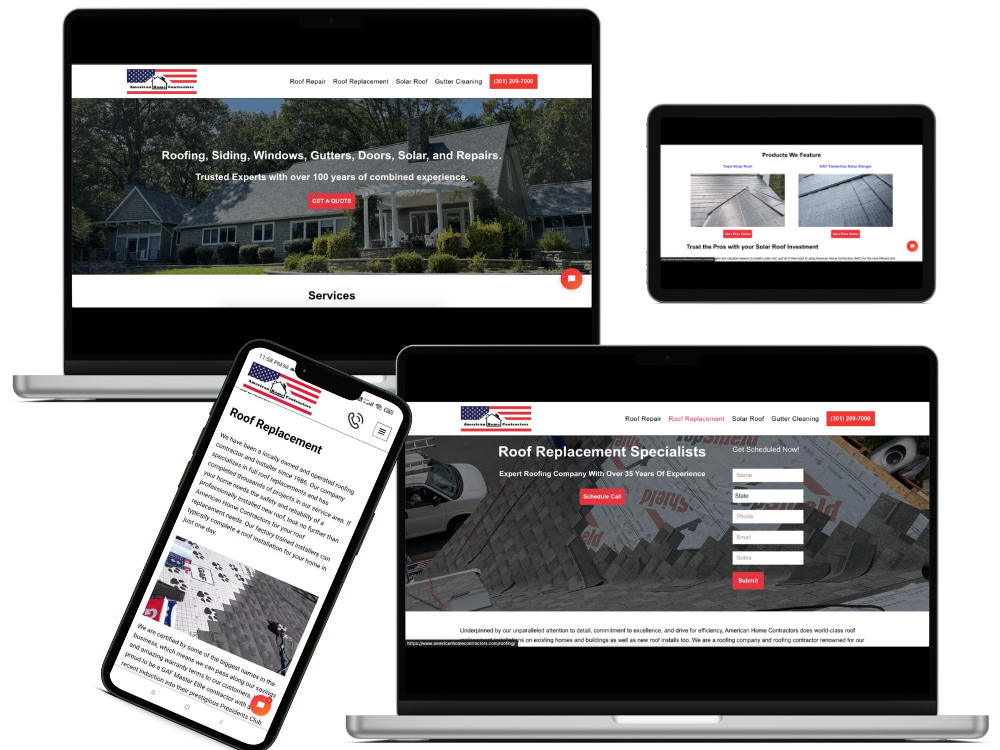
We are proud to have designed and developed the website https://www.americanhomecontractors.com/ for American Home Contractors, a home improvement company based in New Jersey, USA. This was a massive project that required significant attention to detail and expertise in web development. We worked tirelessly, day and night, to ensure that we exceeded our client’s expectations and delivered a website that perfectly captured their brand identity.
Our primary objective was to ensure that the website was visually appealing, user-friendly, and informative while also being optimized for SEO. We understood the importance of designing a website that would attract and retain potential customers seeking home improvement services. To achieve this, we made sure that the website’s design was modern, clean, and intuitive, making it easy to navigate and find information.
We incorporated various features into the website to enhance user experience, such as a chatbox, forms, and a comprehensive resource center. These features were designed to help users access valuable information and resources quickly and improve the website’s SEO rankings. We also placed a significant focus on the website’s loading speed, as we knew that it was crucial in delivering a seamless user experience. We optimized the website’s images, content, and code to ensure that the website loaded quickly and efficiently.
One of the most significant challenges we faced while developing the website was its size. The website was extensive, with multiple pages and subpages, and required significant attention to detail to ensure that every element was consistent and coherent. We worked closely with the client to understand their requirements and preferences, and we incorporated their feedback into the design process.
We also placed a significant focus on SEO optimization, as we understood the importance of improving the website’s visibility and rankings on search engines. To achieve this, we incorporated various SEO techniques such as optimizing the website’s content, meta tags, and descriptions, implementing a clear site structure, and improving the website’s loading speed. This helped improve the website’s SEO rankings and visibility, making it easier for potential customers to find and access the services offered by the company.
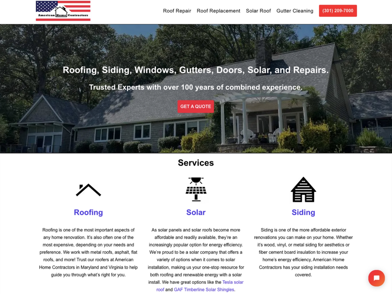
The website showcased American Home Contractors’ wide range of services, which included roofing, gutter making, solar, siding, and windows. We made sure to highlight each service and provide comprehensive information to potential customers about the benefits of choosing American Home Contractors for their home improvement needs.
Throughout the development process, we worked closely with the client to ensure that the website met their expectations. We provided regular updates and feedback to keep them in the loop, and we incorporated their feedback into the design process.
The end result was a website that perfectly captured the essence of American Home Contractors, highlighting their expertise and dedication to providing high-quality home improvement services. The website was visually appealing, user-friendly, informative, and optimized for SEO. We were thrilled to see that the client was exceptionally happy with the final result and praised our team for delivering a website that exceeded their expectations.
In conclusion, we are proud to have designed and developed the website https://www.americanhomecontractors.com/ for American Home Contractors. We worked hard to ensure that the website was visually appealing, user-friendly, informative, and optimized for SEO. The website showcased the company’s wide range of services, including roofing, gutter making, solar, siding, and windows. We believe that the website we built is a testament to our commitment to delivering innovative solutions that cater to our clients’ needs. We are grateful for the opportunity to work on this project and thank the client for entrusting us with their website.
ASKANDREWTAN
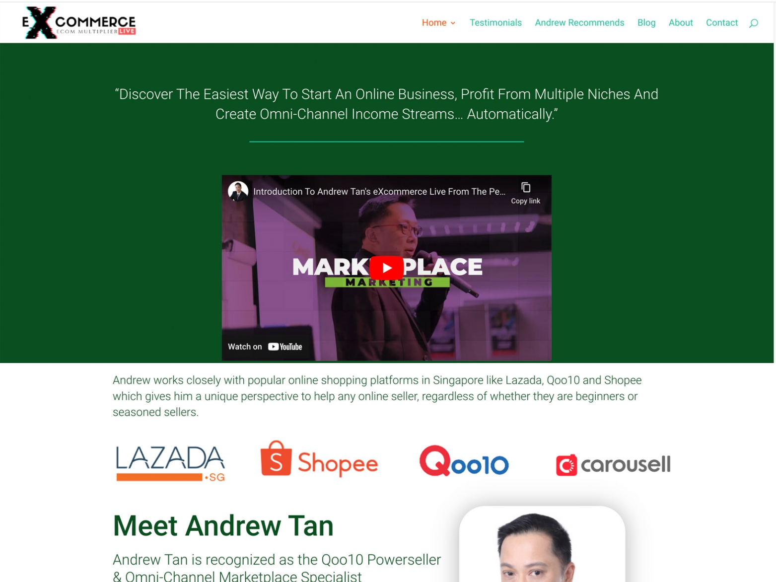
At our company, we recently had the opportunity to work with the team at askandrewtan.com to help them address some issues they were experiencing with their website. The site had been live for some time but was facing some significant problems that were causing issues for users trying to access the site. Specifically, many of the site’s elements were not properly aligned, and users were having difficulty accessing the site’s content.
We were excited to have the chance to work on this project, as we have a passion for helping businesses succeed online. We understood the importance of having a functional website that is accessible to users and can help to promote a business and its products or services.
To begin our work on the askandrewtan.com website, we first conducted a thorough analysis of the site to identify the specific problems that were causing issues for users. We quickly discovered that many of the site’s elements were not properly aligned, which was causing the site to load improperly on many devices. Additionally, we identified several issues with the site’s coding that were causing other functionality issues.
Once we had identified the specific problems with the site, we began working on solutions. We used a variety of tools and techniques to address the issues, including adjusting the site’s coding, optimizing images and other elements for better performance, and adjusting the site’s layout to ensure that all elements were properly aligned. We worked closely with the team at askandrewtan.com throughout the process to ensure that our solutions aligned with their needs and vision for the site.
After several weeks of hard work, we were able to successfully address all of the issues that had been causing problems for users accessing the site. The site was now fully functional, with all elements properly aligned and accessible to users on a wide range of devices. The team at askandrewtan.com was thrilled with the results and expressed their gratitude for our work on the project.
In conclusion, we were proud to have the opportunity to work with the team at askandrewtan.com to help them address the issues they were facing with their website. We were able to identify and address several critical issues that were causing problems for users accessing the site. Our team worked diligently to provide solutions that aligned with the client’s needs and vision for the site, and we were thrilled to see the positive impact of our work. We look forward to continuing to work with askandrewtan.com in the future and are excited to see the continued success of their website.
AROCONLLC
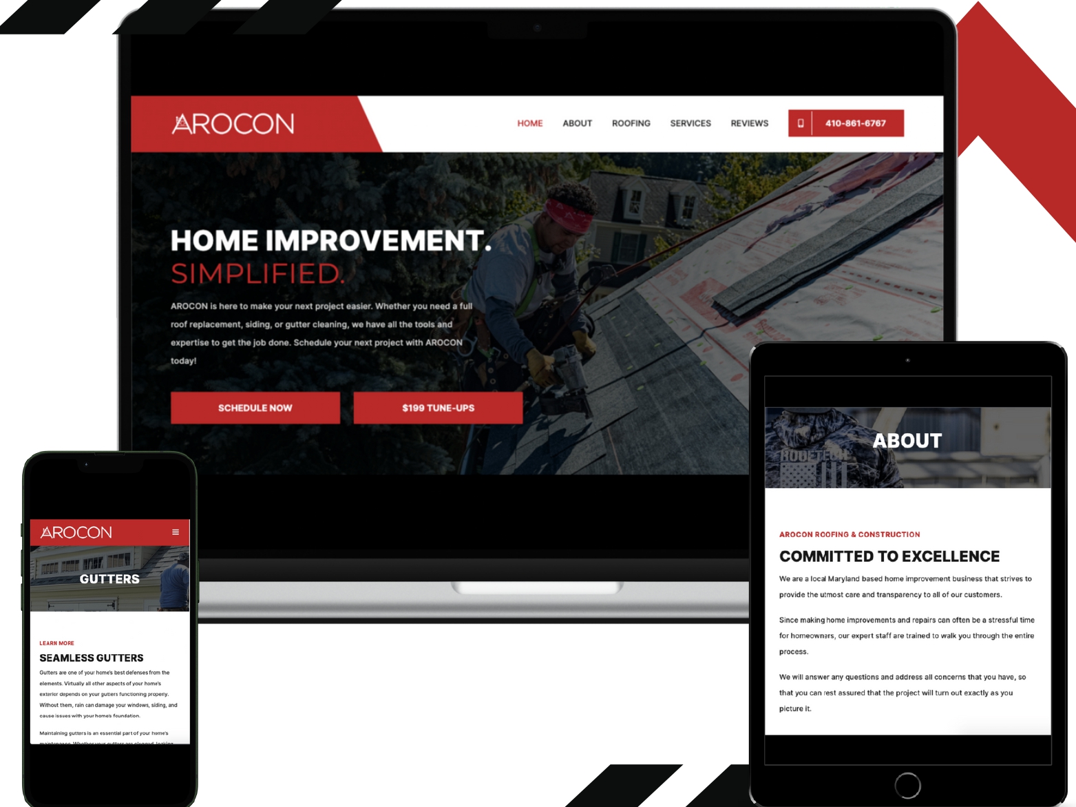
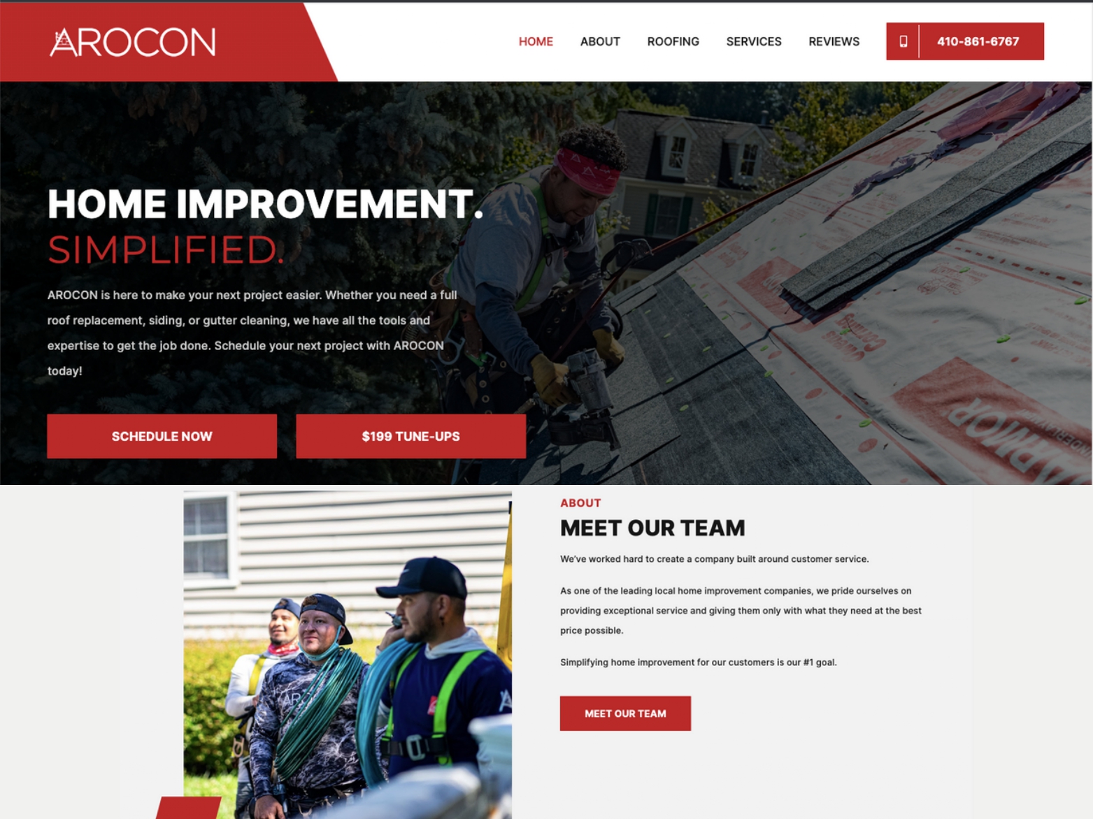
As a web developers, we had the opportunity to work on the website https://www.aroconllc.com/ for Arocon Roofing and Construction. It was an exciting project that provided opportunities for growth and learning.
The client was very satisfied with the website that we built for them. Our team worked closely with the client to ensure that their vision was captured and implemented into the website. We were able to deliver a user-friendly website that featured all of the necessary elements required for a roofing and construction company.
One of the most rewarding aspects of working on this project was seeing the positive impact that our work had. We were able to provide the client with a website that featured several key features that have helped to improve the user experience.
One such feature is the gallery of completed projects. This section of the website showcases the company’s work and provides users with examples of their capabilities. The gallery features images of completed projects, along with descriptions of the work that was done. This feature is a valuable resource for anyone looking to hire the company for their services.
Another important feature of the website is the blog. The blog provides users with valuable information about roofing and construction, including tips for maintaining and improving their homes. The blog also allows the company to establish themselves as a thought leader in their industry and build trust with their potential customers.
In addition to these features, the website also includes information about the company, their services, and a contact page where users can request a quote or contact the company for further information. The website is user-friendly and provides users with all of the necessary information that they need to make an informed decision.
We are grateful for the opportunity to work on this project and for the positive feedback that we have received from the client. It is always rewarding to see our work make a positive impact, and we are proud of the work that we have done on this project.
In conclusion, the website https://www.aroconllc.com/ was an exciting project that provided opportunities for growth and learning. We were able to work closely with the client to build a user-friendly website that featured several key features that have helped to improve the user experience. We are grateful for the opportunity to work on this project and for the positive feedback that we have received from the client.
As a web developer, we appreciate the opportunity to work on projects like these, where we can help to improve the online presence of a business and make a positive impact on their success. We look forward to future collaborations with other clients and are excited to continue our work in the web development industry.
POINT OF REFERENCE

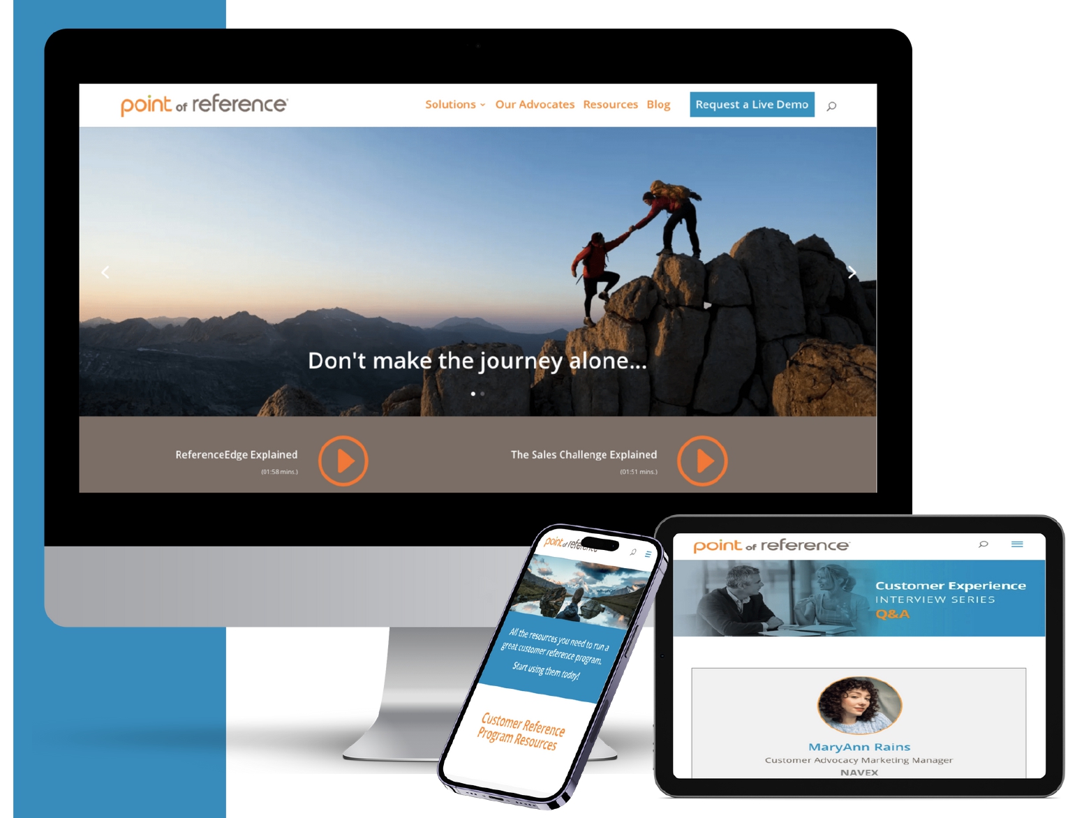
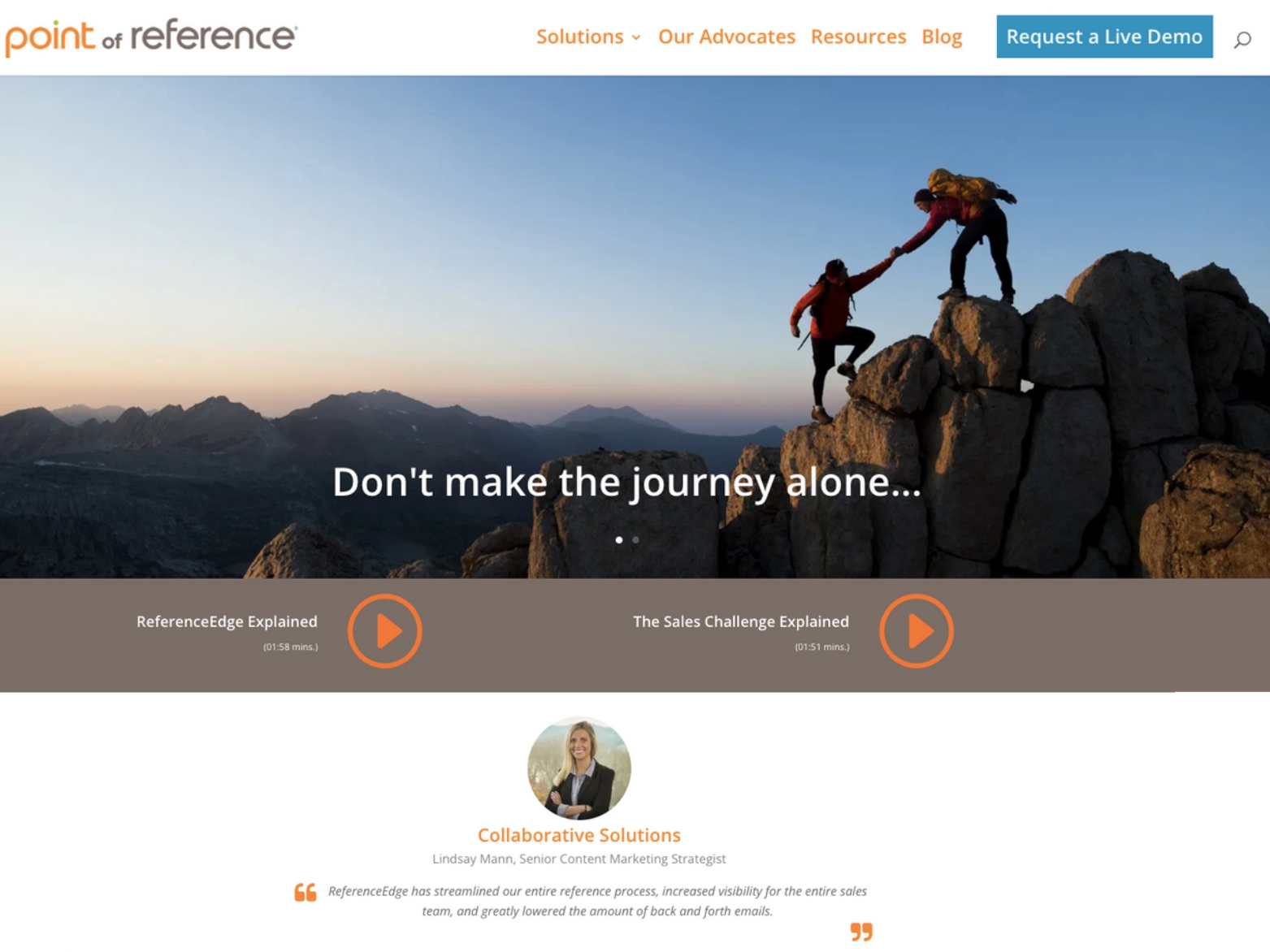
We are proud to have developed the website https://www.point-of-reference.com for our client based in the USA. The website was an exciting challenge for us, as we had to overcome various obstacles to deliver a functional and visually appealing site while ensuring it was SEO-friendly.
Our team worked closely with the client to understand their requirements and expectations for the website. We knew that the website needed to be SEO-friendly, user-friendly, easy to navigate, and aesthetically pleasing while conveying the client’s brand identity. We worked diligently to deliver a website that met all of these criteria.
One of the most significant challenges we faced while developing the website was ensuring that it was optimized for SEO. We worked closely with our SEO experts to ensure that the website’s design and content were SEO-friendly. We ensured that the website had a clear site structure, optimized URLs, meta descriptions, and title tags, making it easier for search engines to crawl and index the site’s pages.
Another challenge was creating a seamless user experience that was also SEO-friendly. We aimed to ensure that users could quickly navigate the website, find the information they were looking for, and interact with the site’s features easily. We made sure that the website’s design was user-friendly and accessible across all devices, ensuring that it was responsive and optimized for all devices.
The website’s design was also a crucial aspect of the project. We wanted to create a visually appealing website that would resonate with the client’s target audience while being SEO-friendly. We worked closely with the client to understand their brand identity, color schemes, and design preferences. The result was a website that incorporated the client’s brand identity while maintaining a modern and clean design aesthetic that was also optimized for SEO.
We also incorporated various features into the website to enhance user experience and improve SEO rankings, such as a blog section, newsletter sign-up, and a comprehensive resource center. These features were designed to help users access valuable information and resources quickly and improve the website’s SEO rankings.
Despite the challenges we faced, we are thrilled to report that the client is exceptionally happy with the final result. They praised our team for delivering a website that exceeded their expectations and perfectly captured their brand identity while also being optimized for SEO.
We are proud to have delivered a website that not only met the client’s expectations but also exceeded them while being SEO-friendly. We believe that the website we built is a testament to our commitment to delivering innovative solutions that cater to our clients’ needs. We are grateful for the opportunity to work on this project and thank the client for entrusting us with their website.
In conclusion, we are proud to have designed and developed the website https://www.point-of-reference.com. Our team overcame various challenges to deliver a functional and visually appealing website that perfectly captured the client’s brand identity while being SEO-friendly. We are thrilled that the client is happy with the final result, and we look forward to taking on new challenges and delivering innovative solutions for our clients in the future.
Brian Hamilton
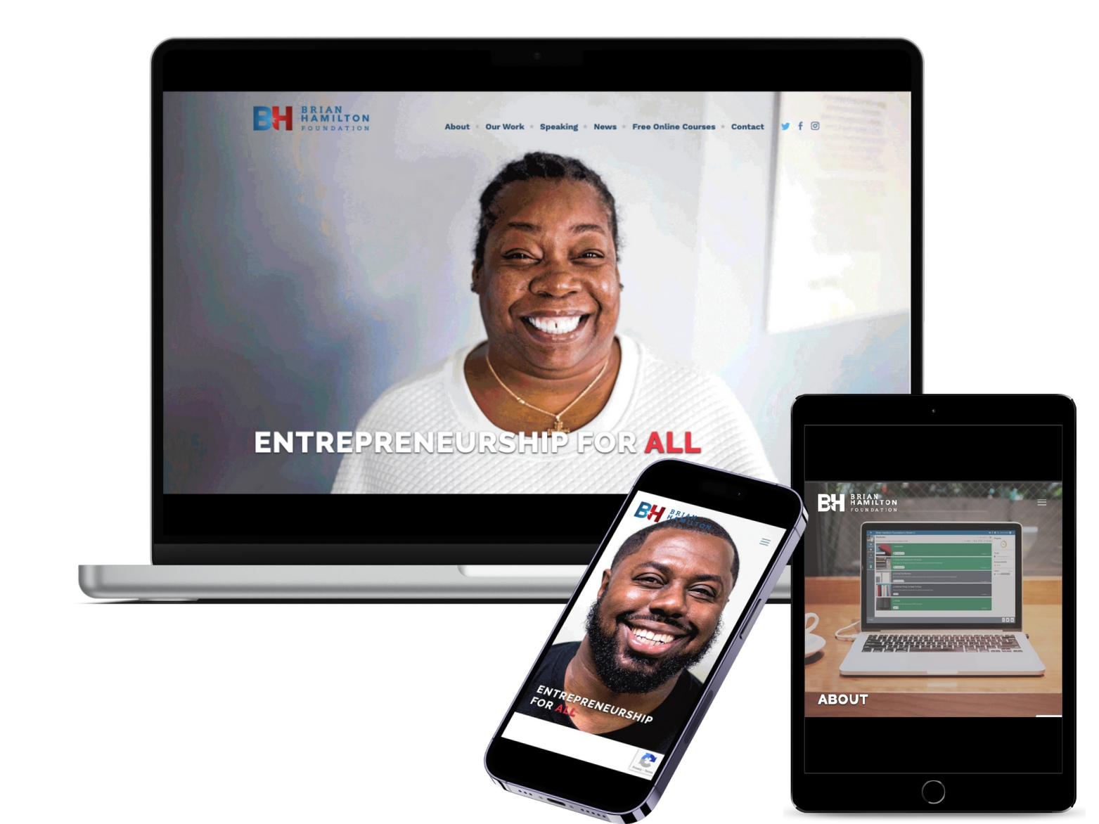
The website https://brianhamilton.org/ is a comprehensive and valuable resource for anyone interested in entrepreneurship. The site is dedicated to providing support and guidance for entrepreneurs of all ages, backgrounds, and experience levels. From business planning and financing to marketing and networking, the site offers a wealth of resources to help aspiring entrepreneurs succeed.
As someone who has worked on this website, I can attest to the high quality of the resources and the dedication of the team behind it. The site is well-organized and easy to navigate, with clear and concise information on a wide range of topics related to entrepreneurship.
One of the standout features of this website is its emphasis on youth entrepreneurship. The site includes a dedicated section for young entrepreneurs, with articles, videos, and other resources designed to help young people get started in business and navigate the challenges they may face.
The site also offers a range of tools and resources for business planning and financing, including templates for business plans and financial projections, as well as information on different types of funding and investment options. This is particularly valuable for entrepreneurs who are just starting out and may not have a lot of experience with the financial aspects of running a business.
In addition to its focus on youth entrepreneurship and business planning, the site also offers a wealth of resources on marketing and networking. From social media and online marketing to traditional networking strategies, the site provides practical advice and guidance for entrepreneurs looking to grow their businesses and connect with potential customers and partners.
Another key feature of this website is the emphasis on community and collaboration. The site includes a section for entrepreneurs to connect with one another and share ideas and experiences. This is a valuable resource for entrepreneurs who may feel isolated or disconnected from others in their industry, and it can provide a much-needed sense of support and camaraderie.
Of course, none of this would have been possible without the support and guidance of the client who commissioned the work. As someone who has worked on this project, I am grateful for the opportunity to have contributed to such an important resource, and I am especially grateful for the client’s support throughout the process.
In conclusion, the website https://brianhamilton.org/ is a valuable and comprehensive resource for anyone interested in entrepreneurship. From business planning and financing to marketing and networking, the site offers a wealth of resources to help entrepreneurs succeed. The site’s focus on youth entrepreneurship and community-building is particularly notable, and it is clear that the team behind this website is deeply committed to supporting entrepreneurs of all ages and backgrounds. I am proud to have contributed to this project, and I look forward to seeing the impact it will have on the next generation of entrepreneurs.
Quality Car Dealer
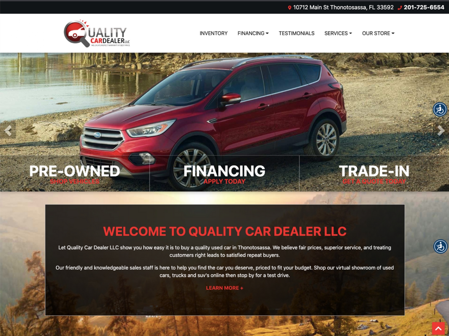
As a web developer, we had the opportunity to work on the website https://www.qualitycardealer.com/ and are proud of the work that we have done. It was an exciting project that provided challenges and opportunities for growth and learning.
The client was very satisfied with the website that we built for them. Our team worked closely with the client to ensure that their vision was captured and implemented into the website. We were able to deliver a user-friendly website that featured all of the necessary elements required for an online car dealership.
One of the most rewarding aspects of working on this project was seeing the positive impact that our work had. We were able to provide the client with a website that featured several key features that have helped to improve the user experience.
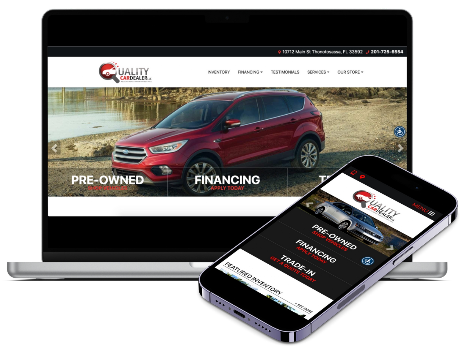
One such feature is the ability to browse and compare a variety of new and used cars. The website displays the cars with photos, descriptions, and pricing information, making it easy for users to find the car that best suits their needs and budget. Users can also search for cars based on their preferences, such as make, model, or price range, which makes the car buying process more efficient.
Another key feature of the website is the ability for users to schedule a test drive. This feature allows users to book a test drive directly through the website, which saves time and makes the process more convenient. In addition, the website also allows users to apply for financing and get a trade-in appraisal, which further simplifies the car buying process.
Overall, our team was able to build a website that not only met the client’s needs but also exceeded their expectations. We were able to incorporate several key features that helped to improve the user experience and make the car buying process more accessible and convenient.
We are grateful for the opportunity to work on this project and for the positive feedback that we have received from the client. It is always rewarding to see our work make a positive impact, and we are proud of the work that we have done on this project.
In conclusion, the website https://www.qualitycardealer.com/ was an exciting project that provided opportunities for growth and learning. We were able to work closely with the client to build a user-friendly website that featured several key features that have helped to improve the user experience. We are grateful for the opportunity to work on this project and for the positive feedback that we have received from the client.
Crushco Engineering
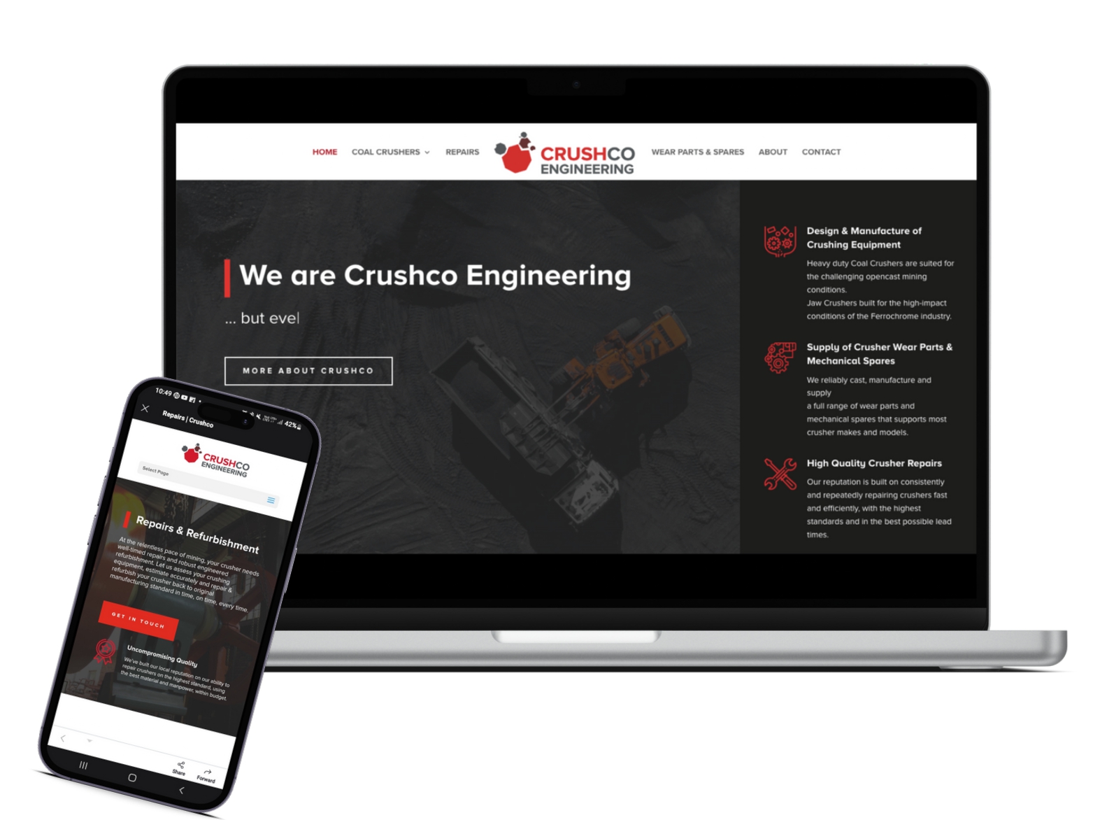
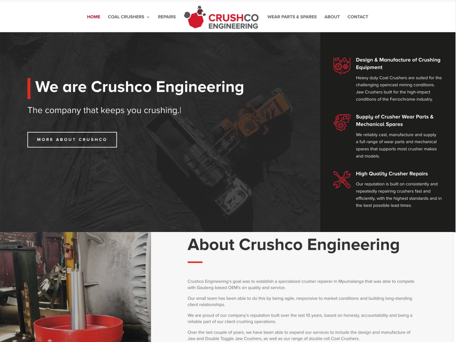
We were delighted to design and develop the website for Crushco Engineering, a South African company that specializes in manufacturing and supplying high-quality crusher wear parts. Our client wanted a website that would showcase their products, services, and expertise while being user-friendly, informative, and optimized for SEO.
One of the most significant challenges we faced while developing the website was to create a design that would resonate with the client’s target audience. We worked closely with the client to understand their brand identity, color schemes, and design preferences. We incorporated their feedback into the design process, resulting in a website that reflected their brand’s essence while maintaining a modern and clean design aesthetic.
SEO optimization was a critical aspect of the project. We understood that the website’s success would depend on its visibility and rankings on search engines. We incorporated various SEO techniques, such as optimizing the website’s content, meta tags, and descriptions, implementing a clear site structure, and improving the website’s loading speed. This helped improve the website’s SEO rankings and visibility, making it easier for potential customers to find and access the products and services offered by the business.
The website was user-friendly, making it easy to navigate and find information. We incorporated various features into the website to enhance user experience, such as forms for inquiries, social media integration, and a blog section. These features helped potential customers access valuable information and resources quickly and improved the website’s SEO rankings.
As the website was built using WordPress, it was easy to manage and update. The client could add or edit content, update images, and manage their inquiries with ease. We also provided training to the client to ensure that they could manage the website effectively.
Throughout the development process, we worked closely with the client to ensure that the website met their expectations. We provided regular updates and feedback to keep them in the loop, and we incorporated their feedback into the design process. The client was happy with the final result and praised our team for delivering a website that exceeded their expectations.
In conclusion, we are proud to have designed and developed the website https://crushco.za.com/ for our client based in South Africa. We believe that the website we built is a testament to our commitment to delivering innovative solutions that cater to our clients’ needs. The website was visually appealing, user-friendly, informative, and optimized for SEO. We are grateful for the opportunity to work on this project and thank the client for entrusting us with their website.
Nagpur IT Training Institute
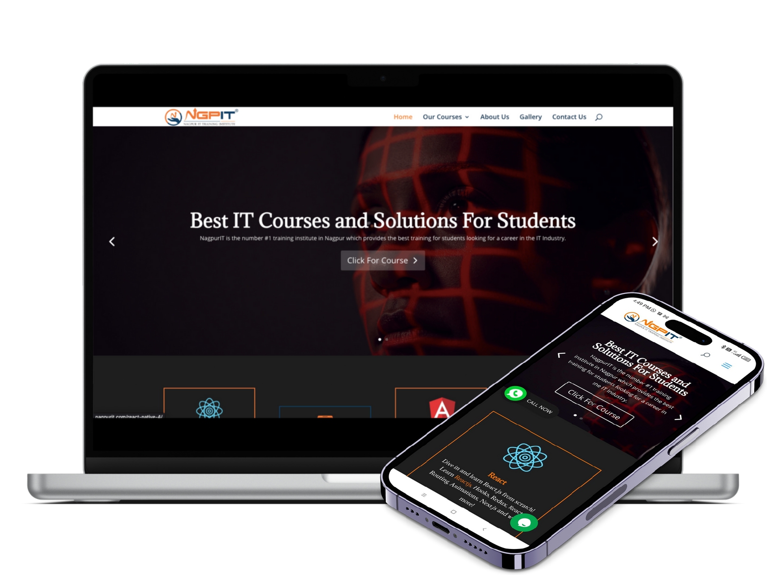
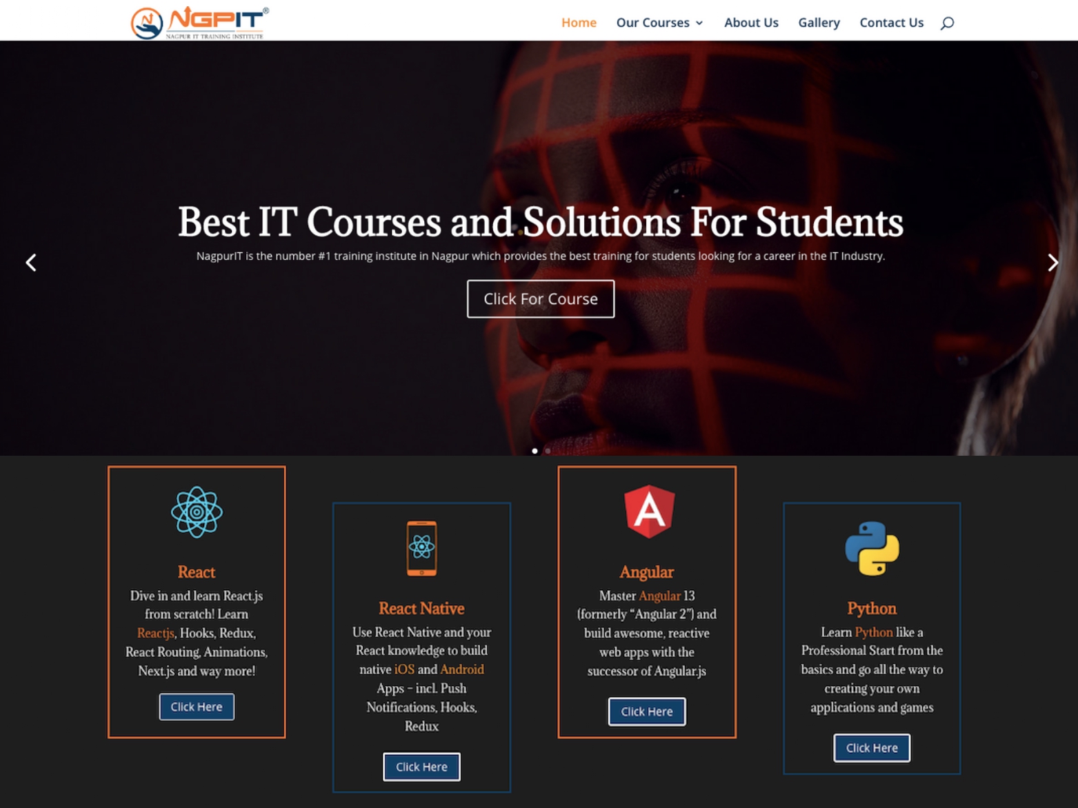
We had the pleasure of designing and developing the website https://www.nagpurit.com/ for an IT training institution based in Nagpur, India. As a team, we built the website from scratch, with a focus on enhancing the user experience, conveying the importance of IT-related courses, and optimizing the website for SEO.
Our primary objective was to ensure that the website was visually appealing and user-friendly. We believed that it was crucial to create a website that would attract and retain students seeking IT-related courses. To achieve this, we made sure that the website’s design was modern, clean, and intuitive, making it easy to navigate and find information.
We incorporated various features into the website to enhance user experience, such as a search bar, filters, and a comprehensive resource center. These features were designed to help students access information and resources related to the courses offered by the institution.
In addition, we placed a significant focus on the website’s content. We believed that it was essential to provide students with comprehensive information about the courses and the benefits of pursuing an IT-related course. We worked closely with the client to create content that was informative, engaging, and relevant to the target audience. We made sure to incorporate keywords and phrases to improve the website’s SEO rankings without compromising on the content’s quality.
Throughout the development process, we worked closely with the client to ensure that the website met their expectations. We provided regular updates and feedback to keep them in the loop, and we incorporated their feedback into the design process.
One of the most significant challenges we faced while developing the website was SEO optimization. We understood the importance of SEO optimization in improving the website’s visibility and rankings on search engines. To achieve this, we incorporated various SEO techniques such as optimizing the website’s content, meta tags, and descriptions, implementing a clear site structure, and improving the website’s loading speed.
The website’s design was also a crucial aspect of the project. We aimed to create a visually appealing website that would resonate with the client’s target audience. We worked closely with the client to understand their brand identity, color schemes, and design preferences. The result was a website that incorporated the client’s brand identity while maintaining a modern and clean design aesthetic.
We also integrated various features into the website to enhance user experience and improve SEO rankings, such as a blog section, newsletter sign-up, and a comprehensive resource center. These features were designed to help users access valuable information and resources quickly and improve the website’s SEO rankings.
The website’s launch was a massive success, and we were thrilled to see that the client was exceptionally happy with the final result. They praised our team for delivering a website that exceeded their expectations and perfectly captured their brand identity while being optimized for SEO.
In conclusion, we are proud to have designed and developed the website https://www.nagpurit.com/ for an IT training institution in Nagpur, India. We worked hard to ensure that the website was visually appealing, user-friendly, and informative, making it easier for students to understand the courses’ importance and the benefits of joining them. Additionally, the website’s SEO optimization helped improve its visibility and rankings on search engines. We believe that the website we built is a testament to our commitment to delivering innovative solutions that cater to our clients’ needs. We are grateful for the opportunity to work on this project and thank the client for entrusting us with their website.
Pratikshalay
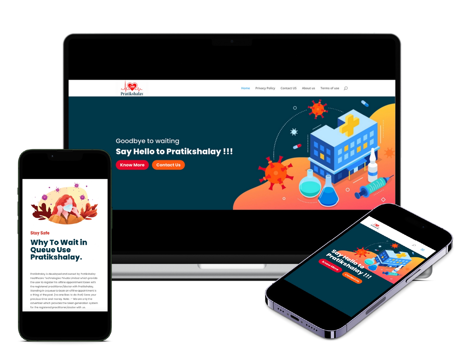
Pratikshalay is a mobile application that has been designed to revolutionize the way patients and doctors manage appointments. The app allows patients to generate tokens before their appointment, reducing wait times and avoiding crowded waiting rooms. Doctors can use the app to manage their schedules and appointments, ensuring that they can see all their patients on time.
The app is built using React Native technology and is available on both Android and iOS platforms. This has made it accessible to a wide range of users, making it a popular choice among both doctors and patients. The app’s user-friendly interface and intuitive design have made it easy for users of all ages and technical abilities to schedule appointments, generate tokens, and manage their schedules.
The Pratikshalay app has been particularly useful in the era of COVID-19, where social distancing and avoiding crowded places have become a necessity. The app allows patients to avoid crowded waiting rooms and reduce their exposure to the virus. This has made it a popular choice among patients who are looking for a safer and more convenient way to manage their appointments.
The app has gained a lot of popularity in a short amount of time, with over 200 doctors and 2000 patients currently using the app. This is a testament to the app’s effectiveness in managing appointments and generating tokens, making it easier for doctors and patients to stay on time.
One of the key features of the Pratikshalay app is its ability to help doctors and patients stay on time. The app allows doctors to manage their schedules and appointments more efficiently, reducing wait times for patients. This not only makes the experience more pleasant for patients but also ensures that doctors can see all their patients on time.
Another key feature of the Pratikshalay app is its ability to generate tokens. Patients can generate tokens before their appointment, which helps them avoid waiting in long queues. The app also allows doctors to manage their schedules and appointments, ensuring that they can see all their patients on time.
The Pratikshalay app has been designed to be user-friendly and intuitive. The app’s interface is easy to use, making it accessible to users of all ages and technical abilities. Patients can schedule appointments and generate tokens with just a few taps on their mobile device. Doctors can manage their schedules and appointments with ease, ensuring that they can see all their patients on time.
The app’s intuitive design has made it a popular choice among users, who appreciate its ease of use and convenience. Patients and doctors alike have found the app to be a useful tool in managing appointments and reducing wait times.
Overall, the Pratikshalay app is a revolutionary mobile application that has been designed to help patients and doctors manage appointments more efficiently. The app’s user-friendly interface, intuitive design, and ability to help doctors and patients stay on time have made it a popular choice among users. We are proud to have been involved in the development of this app, and we look forward to seeing its continued success in the future.
Dr.Hemant Chaudhari’s Homeo Clinic
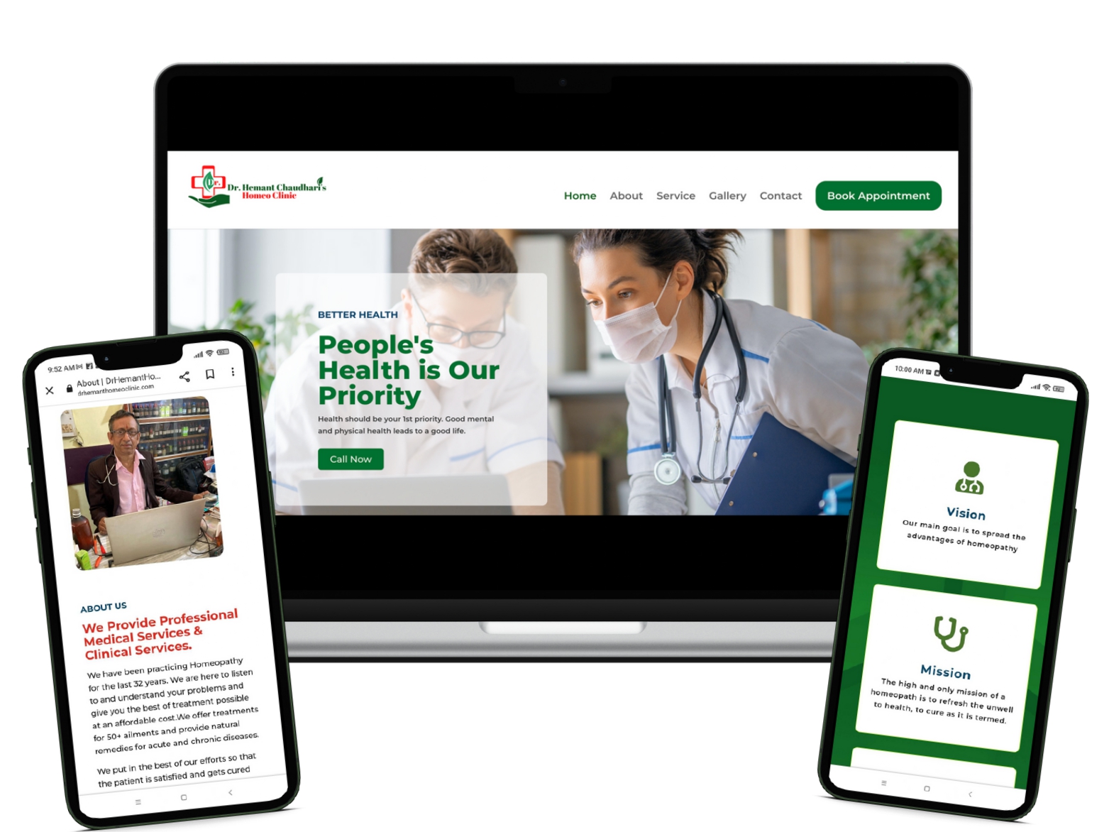
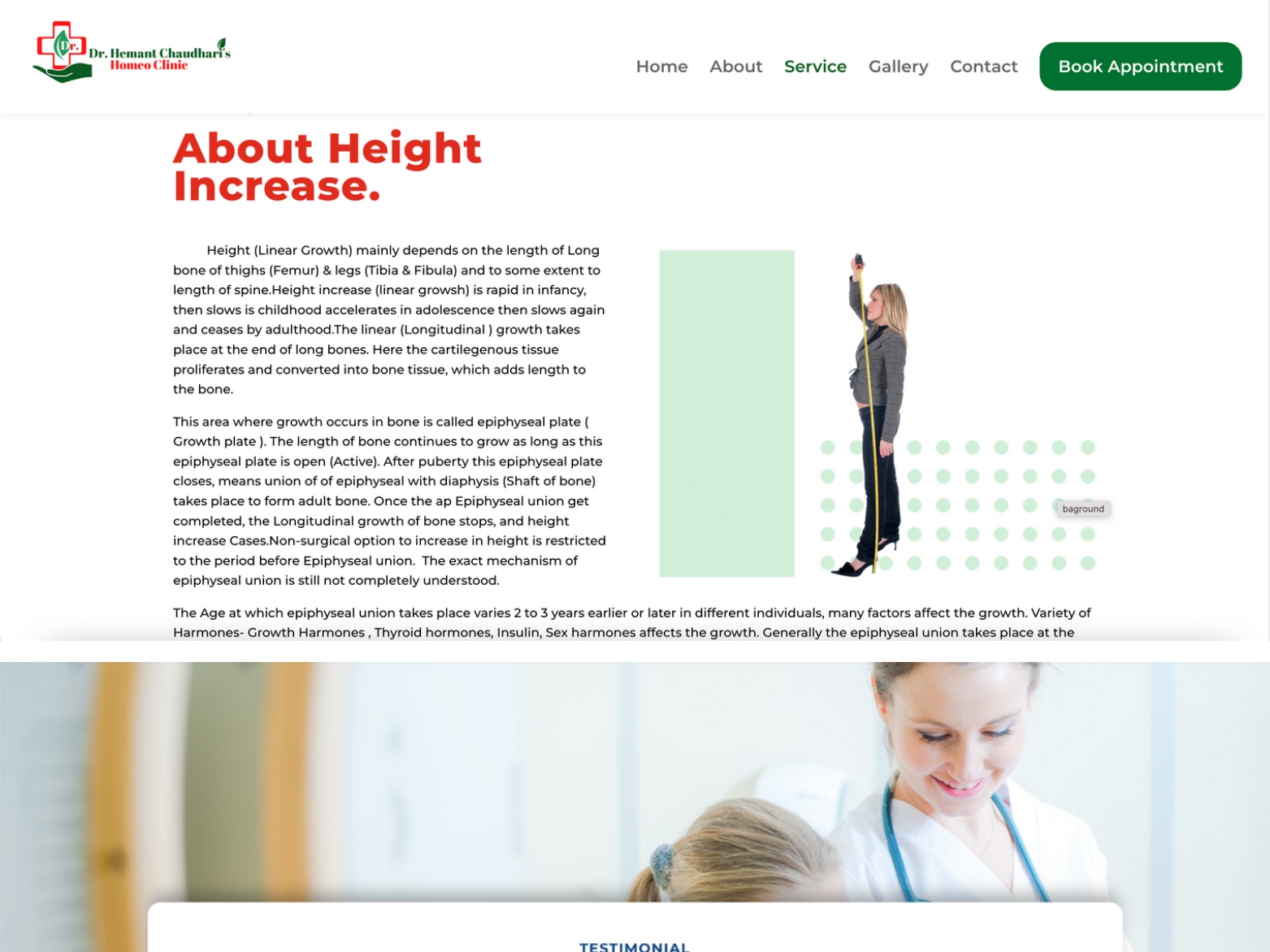
We are proud to have designed and developed the website https://drhemanthomeoclinic.com/ for Dr. Hemant’s Homeo Clinic, a renowned homeopathy clinic based in India. Our primary objective was to design a website that was smooth, easy to navigate, and optimized for SEO. We understood the importance of creating a website that would attract potential customers seeking medical services and enable the clinic to expand its reach.
The website’s design was essential in reflecting the clinic’s brand identity and services. We worked closely with Dr. Hemant to understand his preferences and requirements and incorporated them into the design process. The color green was a prominent feature in the design, as it represented the healing and rejuvenating properties of homeopathy.
One of the most significant challenges we faced while developing the website was to ensure that it was user-friendly and accessible. We understood that patients seeking medical services would be looking for quick and easy access to information about the clinic and its services. To achieve this, we made sure that the website’s design was modern, clean, and intuitive, making it easy to navigate and find information.
We incorporated various features into the website to enhance user experience, such as forms for appointments, patient testimonials, and a blog section. These features helped patients access valuable information and resources quickly and improved the website’s SEO rankings. We also placed a significant focus on the website’s loading speed, as we knew that it was crucial in delivering a seamless user experience. We optimized the website’s images, content, and code to ensure that the website loaded quickly and efficiently.
SEO optimization was a crucial aspect of the project, as we understood the importance of improving the website’s visibility and rankings on search engines. We incorporated various SEO techniques, such as optimizing the website’s content, meta tags, and descriptions, implementing a clear site structure, and improving the website’s loading speed. This helped improve the website’s SEO rankings and visibility, making it easier for potential customers to find and access the services offered by the clinic.
The website showcased Dr. Hemant’s Homeo Clinic’s wide range of services, including Professional Medical Services & Clinical Services. We made sure to highlight each service and provide comprehensive information to potential customers about the benefits of choosing homeopathy for their medical needs.
Throughout the development process, we worked closely with Dr. Hemant to ensure that the website met his expectations. We provided regular updates and feedback to keep him in the loop, and we incorporated his feedback into the design process.
The end result was a website that perfectly captured the essence of Dr. Hemant’s Homeo Clinic, highlighting their expertise and dedication to providing high-quality homeopathic services. The website was visually appealing, user-friendly, informative, and optimized for SEO. We were thrilled to see that the website had more than 100 patient visits in his clinic and that Dr. Hemant was exceptionally happy with the final result.
In conclusion, we are proud to have designed and developed the website https://drhemanthomeoclinic.com/ for Dr. Hemant’s Homeo Clinic. We believe that the website we built is a testament to our commitment to delivering innovative solutions that cater to our clients’ needs. We are grateful for the opportunity to work on this project and thank Dr. Hemant for entrusting us with his website.
